The story of my heart

This is a mini art journal that I created, using a 5.5 x 3.5 inch notebook from Archie McPhee as the base. I got it from American Science and Surplus as a three-pack, on sale. The notebook said “people to avoid” on the outside.

cover

All of this took about a week, because of the many layers that had to completely dry.

p1

I pulled out several sections from the middle of the book to give me enough room to add what I wanted to add. I find this step critical to producing a final piece that is flat-ish.

p2

I worked on this as a complete unit – not page by page, but I’d do each part of the process to the whole book.

p3.jpeg

I used gesso to prime the pages.

p4.jpeg

I added various washi tape to the edges, mostly where the pages had started to come apart from the gesso. It had made the pages stick to each other and I’d had to pull them apart.

p5.jpeg

Then I added swipes of “Distress Ink” mini stamp pads to the pages, pressing them together and then opening them back up to create a transfer. Getting this to dry without permanently sticking the pages together was a real bear. I had to keep checking on it. I suspect I should have painted each page separately instead of doing the entire thing at once, but that would have taken a lot longer.

p6.jpeg

I pulled out my used copy of “Mysticism” by F.C. Happold and pulled out some random pages. I used the mini stamp pads to color them.

p7

Once dry, I randomly tore the pages into smaller pieces. Only when that was done did I look at the words on the pages to choose which ones would be in the book. This is how the title of the mini journal came about – it was on the section I’d randomly chosen for the first page.

p8.jpeg

I then selected various brown and sepia stamps to add.

p9.jpeg

I added every Chinese fortune cookie message I had that had a “Learn Chinese” message on it. This tiny art journal is a mini Chinese dictionary.

p10

I used brown ink to color the cover, added more stamps and stickers, and then sealed with with contact paper once dry.

p11p12p13p14p15p16p17p18p19 back

Spring bottles

This is an art-journal page I made recently.  Because of the spiral in the journal, some of the image isn’t flat on the scanner, resulting in a lack of sharpness.

sp1

(detail)

sp2When I transcribed the quote, I wrote it as

“To one who has faith, no explanation is necessary. To one who is without faith, no explanation is possible.” – Thomas Aquinas

but it is really

“To one who has faith, no explanation is necessary. To one without faith, no explanation is possible.” – Thomas Aquinas

Someone on a Facebook page said that it is really from St. Ignatius of Loyola – that there is a bronze bust of St. Ignatius at the Casa Dom Inacio in Brazil with this quote on it. However, all the indications online say it is from Aquinas.


Mixed-media art journal (Strathmore).  Watercolor pencils.  Distress ink pads. English stamps.  Distress ink.  White pen.  Skeleton leaf.

Community meditation – art journal

commune

Page about what it means to be in community, to work together.  Do we need to live in the same area to be in communion? The communion of the disciples – they shared everything.  Is this a way for us to save money – to defeat the housing crisis, the sense of alienation and loneliness?  To help those who have nobody to help them (spouse has died, family is abusive).  We are made to be together – not to be separate islands.  The Tiny House movement would work well if people shared major resources – washer/dryer, lawn equipment.  This is how monasteries work – don’t waste energy on things you can share.  Have time/energy left to help others.

Base is from “Stampington and Company” magazine.  Someone else made it.  I found the stamps on some mail that was sent – either to work or my house.  I like how they look together – but also that penguins have to live and work together to survive.  I like how the red and blue make purple – a synergy – a greater than the sum of the parts.

Tim Holtz words, white gel pen (the brand I found out from someone else on an artist group page).  Fortune cookie message.

Pink meditation

pink meditation

Made 2/2/17   In response to the difficult feelings in the country and the world about the current President.  It is hard to believe what a circus it is.  Meditating on peace, and on what good that comes from brokenness.  It is a time of great change.  Rumi says that you can’t make bread without grinding up grain.  You can’t grow a crop without breaking up the soil first.  It feels that all the ugliness that has simmered underneath has finally risen to the top.  I feel that I’ve come to trust this upheaval as a sign that things are moving.  The stagnation is over – people are waking up.

I wrote the journaling in fluorescent pens so that I can read them, but they are not easily visible here.  Sometimes journaling is private, but the art is meaningful.  I’m trying to figure out how to share and yet be private at the same time.  Some people use hard-to -read lettering – but then I won’t be able to read it myself later.  Or do I need to read it again? Perhaps the art of writing it in the first place is enough.

Gesso, acrylic paint, magazine clippings, aluminum candy wrapper – showing the value in recycling and re-visioning.  Tim Holtz words. Gel pens. Glue stick.


December 2016 art journal pages

While cleaning out my craft room I rediscovered my list of intentions for 2016.  I’d not done many of them – perhaps because I lost the intention list.  Can’t get anywhere without a map. Some I had done, and was glad.  Some I’d forgotten about, and have refocused my commitment.  One thing on it was to make an art journal page at least once a week.  I had some time off from work so I decided to catch up a bit.


“Fragile” – 12/12/16 – 12/15/16       Distress Ink, ephemera, gel pen

fragile

(detail of “Fragile”)

fragile2

“Doppelganger” – 12/15/16  Distress ink, ephemera, colored pencil, gel pen, water

doppleganger

(detail for “Doppelganger”)

doppleganger2

“To be a queen” – 12/16/16   Distress ink, stamps, gel pen, colored pencil

to-be-a-queen

(Detail – “To be a queen”)

to-be-a-queen2

“Paramecium” made around 12/22/16   copied images from 100 year old Biology textbook, Distress ink, broken glass glitter, gel pen, matte medium, Sharpie, white gel pen

paramecium

(detail, Paramecium)

paramecium2

“Shamash” – 12/28 and 29th, 2016   5th and 6th nights of Chanukah.  Distress ink, stamps, gel pen, Sharpie

shamash

(Detail, “Shamash”)

shamash2


None of the above.

Art journal page made 11/12/16.  It is time for each and every one of us to wake up.

none-of-the-above

Our “leaders” aren’t our leaders.  They don’t care about us.  They don’t work for us.

This is a game to them.  This is a puppet show, and we are the puppets.

none-of-the-above6

Turn the TV off. Put down the smartphone.  Don’t look at the news.

Take care of yourself – go for a walk, eat healthy food, read a book to learn something – not to escape.   Now is the time to awaken, not to escape.

none-of-the-above2

We are waking up to the game that we are in.  we vote, but “they” pick the winner.

How about we all vote, but leave every slot on the ballot blank?  This way “they” can’t say it is voter apathy.  We didn’t forget to vote.  We didn’t just stay home.  We showed up, and we said NO.  No more of this.  We are tired of the game because “We the People” always lose.

none-of-the-above3

God is in charge, not any man or woman.  Not any elected official.  God was upset with Israel when they insisted on having a king over them.  God allows us free choice, and watches, hands tied, when we make bad choices.

We will always lose when we put people over us to rule us – when we forget that God is the supreme authority – not any person.  Time to look for other ways to support ourselves, rather than relying on “The Man”.

none-of-the-above4

Time to break up with government.

Time to say “It’s not me – it’s you, government.  It just isn’t working out.”

none-of-the-above5

Background and construction –

Base – the back of a sample ballot – the back was printed with “Page Left Intentionally Blank”.  When I first saw this (this is from a ballot from the Spring of 2016) I thought it was funny to make the page not blank by writing that it was blank.  But now I see something different.  I turned it so “Blank” – nothing  – is up.  You can see the printing of the sample ballot through the page, so it shows that this is about an election.

I included stamps related to America – personal freedom.  Native American.  Statue of Liberty that is Blue and Red and White – not divided, but all three – so not Blue (democratic) States or Red (republican) states, but all of the Union, together. There is even Green, for Independent.  Stamps about war and liberty, about “A common Determination”, about “Industry and agriculture for defense”, about “Security, education , conservation, health for defense.”   Dog tags saying “never forgotten” and a military medal saying “Honoring those who served”.

Ephemera about quality, creativity, unique expressions of each person, of the various and unique cultural and religious traditions that make this country so great.

This is OUR country.  It is time to reclaim it as the great country of individuals who choose to live in freedom – as wide and varied as that term means.

October art

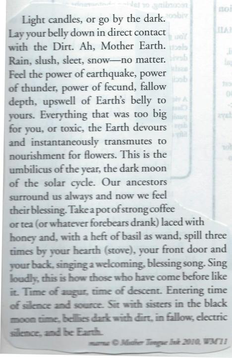
October is about stripping away, of seeing beauty in decay, of letting go. It is about seeing things in new ways, when the trees lose their leaves and reveal their bones.

For this, I’m using a lot of leftovers and pieces I’ve accumulated. Nothing is expensive. It reminds me of how I got my start buying beads at the nearby thrift store and broke them up to make my first necklaces. I could buy a necklace for a quarter, redesign it with a few new beads, and sell it for $15. People don’t appreciate the time or creativity involved in making art, so it is better to not pay too much for materials.

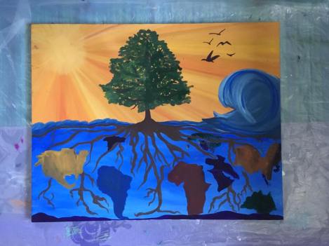
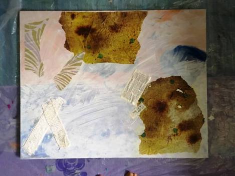
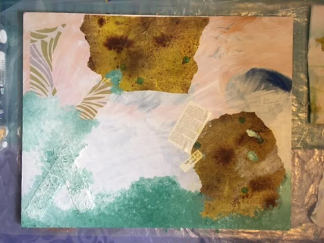
The canvas was bought at Goodwill – already painted. This is a great way to buy a canvas – instead of $40 to $50 for a 24 x 30 inch canvas, this was $15. You can always paint over it. This too is part of the process of letting go – of not feeling I have to keep everything like it is. Change is essential for growth, and letting go is part of that.

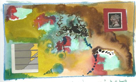
This is what was on it.

1

I found gauze at Target for $1. I actually got it free because my husband had gotten a $5 gift card because he gets his prescriptions filled there. I’ve heard about using gauze as texture – time to try.

2

I painted the canvas with a thin coat of gesso, and affixed the gauze with it.

I’m not very good at putting on gesso yet. But maybe I should use a regular bristle brush and not a foam brush. Most of my bristle brushes are small – not suited for gesso. This is a new experience for me. Here I’m playing with texture.

8

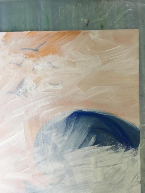
I didn’t entirely cover up the image that was already there. I think it is nice to show what came first, the origin of the piece. You can never fully erase your past – it is always with you, even if you don’t see it.

7

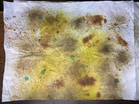
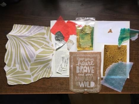
This was paper I got from Yankee Candle – they’d wrapped up my large jar candles in it. I spritzed it with Tim Holtz “Distress Ink” spray stain and a few spritzes of water. I made this last week, not sure what I was going to do with it. I tore it into pieces, saving the parts I liked best. The remaining pieces I’ve already sprayed with more color and will use later (maybe in this project).

10


It is darker on the canvas because it is still wet with matte medium (coated front and back). Perhaps I’d have been better not painting the front with matte medium, since I might put acrylic paint over some of it. We’ll see. This is an exercise, a practice. Mistakes are valuable opportunities for learning.

Detail – some of it tore while I put it on the canvas.   I’ve added a little gesso too.

13

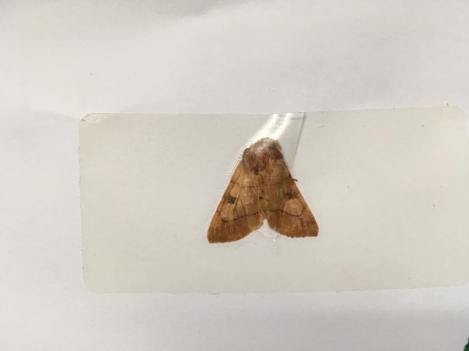
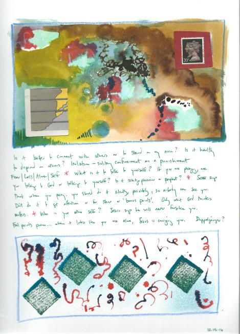
I like this dead moth. I found it in a windowsill at work. I picked it up and saved it with a label protector.  Things die in October.  They have to.  This moth is a reminder that time is precious, yet also not to take it so seriously I forget to live life.

15a

Here is the assortment of papers I intend to use – leftover bits from tissue paper and bags from items I’ve bought, and bits from other projects. I like the saying on the bag I got from the Hallmark store in Boone, NC when I got some rainbow pencils. It is a little large, so I might just write this on the canvas when I’m done. Right now it is nearby as inspiration.

14

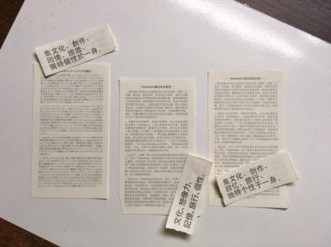
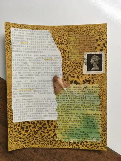
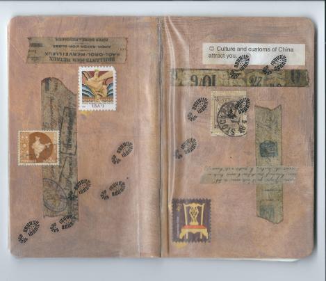
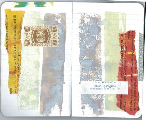
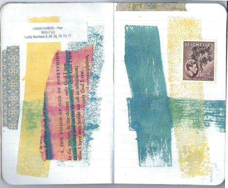
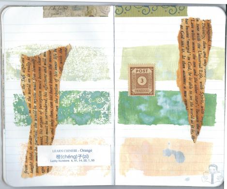
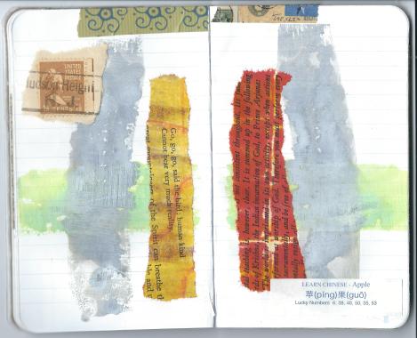
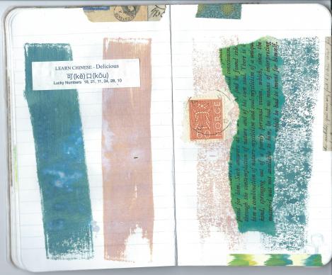
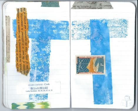
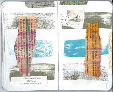
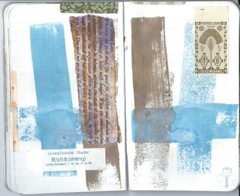
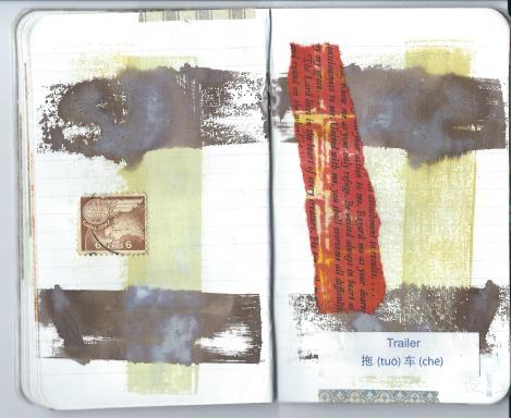
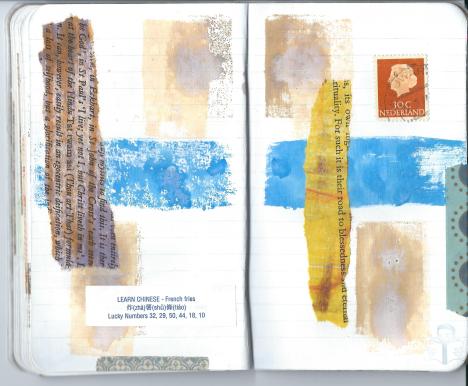
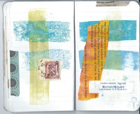
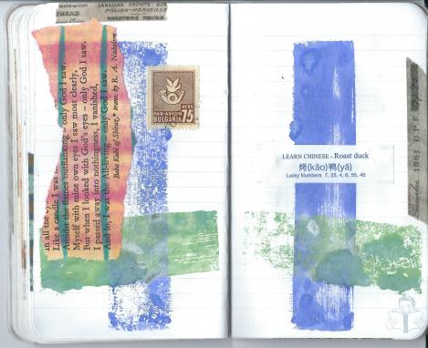
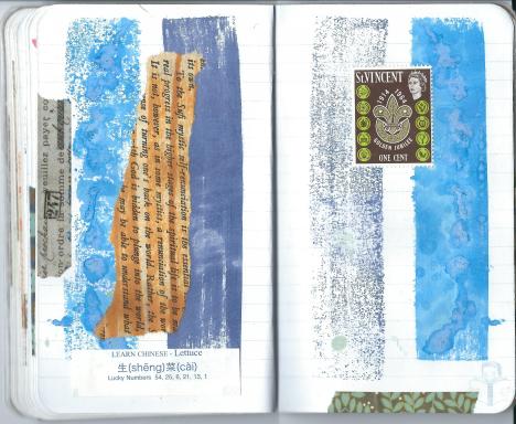
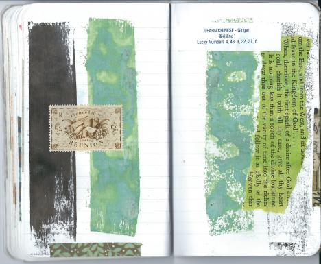
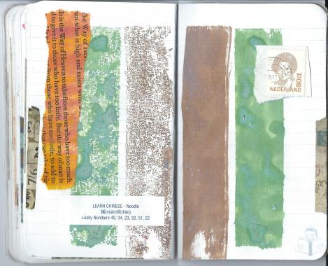
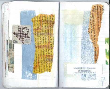
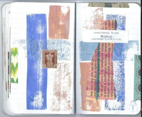
These are the Asian-language instruction pages from a tiny Moleskine journal I found at a used book store in Knoxville. I tore them using a  metal ruler as a straightedge.

9

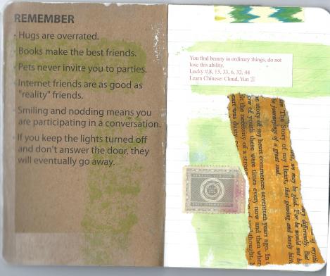
This is a subset – a collage within the collage. I plan to put it in towards the end, but assembled it first.  Some of the pages with words are from Robert’s Rules of Order – I got it for free.  I’m not sure how I made the back.  I definitely used Distress Spray Stain, but it reacted with the paper in an odd way.  I’m pretty sure I couldn’t replicate it.

15b
I added the moth I found to it.

15c
Then I underlined some of the words in gold gel pen.

15d

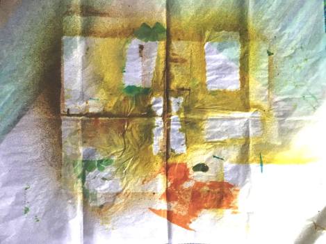
I might use some of this. This is tissue paper that I had under other things that I was spraying. The empty spaces are where they were.

16

This is at the end of day one.

17

(Day two)
Here, I’ve painted some of the corners and edges with acrylic paint, daubed on with my fingers. It is a blend of White with water, Phthalo green blue, Olive green. I’ve used these colors on my bathroom door. They remind me of the color of rust and I’m told it is the color of Parisian municipal things – benches, street lamps, grates. It is the color of rain and mist.

18


detail –

19

I’m sorry some of the pictures are so dark, thus the colors aren’t true. I was working in my craft room which is on the North side of the house, and it was about an hour before sunset on day one, and an hour after sunrise on day two. I could see fine, but the camera thought otherwise. Maybe one day I’ll have an assistant and a professional studio, but for now, this is what you get. That too is part of the art – of using what you have without fear.

When I work more on this, I’ll add it all here rather than make separate posts.

Meditations on death

burial 073116

I’ve been thinking quite seriously about what I would like done with my body when I die. I’ve read a lot of books recently about the options, and learning about what to insist on and what to refuse. This information will help me if my husband dies first, so I will be a well-informed consumer.

Most of us don’t think about this at all, and that is the problem. When we refuse to face the reality of our death, we are unable to embrace the beauty of our life.

Perhaps you’ve heard the terms “green burial” or even “conservation burial”?  This artwork is about my mediation on that.  These burials refer to the body being put into the ground as simply as possible – no embalming, no fancy coffin, no vault.

Many modern cemeteries (often euphemistically termed “memorial gardens” these days) insist on a vault to help with subsidence.  All grave sites cave in somewhat, and that makes it more difficult to mow with large equipment.  Most cemetery owners don’t want to take the time that is required to maintain graves by back-filling with dirt occasionally or mowing with small lawnmowers.

Also, some consumers are under the impression that the are preserving their loved one’s body for eternity with all they do – embalming, buying a metal sealer coffin, using a cement vault.  They are unaware (and often don’t want to be aware) of the reality of death – once a person has died, the body starts to decay.  Nothing will prevent that.  In fact nothing should prevent that.  If we say “ashes to ashes and dust to dust” we should mean that.  Our bodies should return to the earth when our souls return to heaven.

If people are concerned about having a pristine corpse for the resurrection of the dead at the second coming of Jesus, then they need to understand that a God who can make people out of dirt can restore us however we are.  It isn’t right to try to preserve the body unnaturally.  This can become idolatry, where we are more concerned with the outer shell – the body, than the inner essence – the soul.

It is not right for a family to go into debt in a vain effort to preserve their loved one’s body.  In general, the funeral industry charges way too much for its services, and they often rely upon the ignorance of the consumer – the  grieving family  – and their guilt and social pressure to “do the right thing by their loved one” and give them the best (read – most expensive) burial possible.

The “death positive” movement is trying to make informed consumers of the public so that we don’t feel pressured into buying what we don’t need.  It also aims to have people understand the very reality of death – that it is unavoidable.  Choosing not to make your own funeral arrangements is to leave that inevitable decision to those you love.

Not many generations back people took care of their own dead at home, and some are reclaiming that.  A number of federal and state regulations make this difficult if not impossible to do for the average person.  I recommend doing research on this before the need arises if this is of interest to you.

Embalming is not required by any federal, state, or local law.   Funeral directors will heavily insist upon it however if there is to be a viewing, or if the viewing is to be longer than an hour – or away from the funeral home.  The longer the body is at room temperature, the more decay will occur.  Most people in our generation have not seen someone look dead.  They look like they are peacefully asleep.  The funeral industry thinks we need this “memory picture” (their words) to help us accept death.  This makes no sense, as the person does not look dead.  I believe that they have as an industry lulled us into a delusion.

(Warning  – this gets a little hard to read from on out, yet provides important information to consumers.)

Not everything the funeral industry attempts to push on a grieving family is a good idea.

Embalming is an unnecessary and toxic procedure, using chemicals that are known carcinogens.  It is far more invasive than most of us realize.  It is not just replacing the blood with embalming fluid.  That is the first part.  The second part involves using a tool called a trocar to puncture the organs in the abdomen, suck out the fluids in the abdominal cavity, and then refill with more embalming fluid.  All that is left of the person’s body is a facade.  When the second coming occurs, they won’t have a body to resurrect.  You’re better off not embalming at all.  Also – all the bodily fluids that are sucked out simply go down the drain, untreated, into the municipal sewer system.  If prevention of the spread of communicable diseases is the concern, direct cremation is the best way.

Likewise, a sealer coffin is a terrible idea.  It is promoted as a way to “keep Mother Nature out” – but by law the funeral home cannot say that it will preserve your loved one’s body.  It can’t.  With air unable to escape, anaerobic bacteria increase their work and the body decays that much faster.

Vaults or grave liners were originally intended to deter grave robbers.  While that is not the concern it was, it has become common as part of burials.  They are promoted as a way to protect the body from the elements, but they are not permanent.  They often crack, letting in water.  The body ends up swimming in liquid – from inside and outside.  While there are no laws insisting on vaults or grave liners, most cemeteries will insist on them.  This can add several thousand dollars to the cost of the burial.

Meanwhile – you might be thinking cremation is a good idea.  The amount of energy required to cremate a body is equivalent to driving 600 miles.  The average cremation is anywhere from 1400 to 1800 degrees, and lasts 2 to 3 hours.  Afterwards, the body is NOT reduced to ash, as some might think.  The bones are placed inside a machine known as a “cremulator” that crushes them into little pieces, much like a blender.  All told, cremation is a violent process.  Also, the emissions from that are often not cleaned – going straight into the air.  Toxic mercury from fillings goes directly into the atmosphere.


Late July 4×6 collage

Both finished 7-29-16.  I’ve realized that even if this looks like a simple project, it takes more time than I am able or willing to give to it to complete one from start to finish in a single sitting.  So I accept that doing it in stages counts.  Finding and cutting out the images and words from magazines is very time consuming, so I’m grateful I have them organized well to find the clippings when I need them

postcards from the curious 072916


share 072916