Is art right for you?

11 x 14 canvas.

Acrylic paint, gold oil pastel pencil, under-words from a prescription insert for a nose spray, warning labels from prescription bottles, magazine clippings, label from a box of multi-vitamins stamps, silver and black Sharpies, decoupage glue, rubber stamps, ink, watercolor.

Please message me if you are interested in purchasing this one of a kind artwork.

About how art is better for you than prescriptions.

Full image –
1

Details –

2

3

4

5

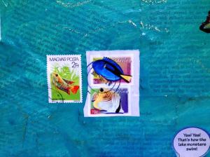
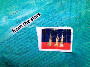
Menfish from the Stars

11 x 14 canvas.

Under-words from “The Silent World” by Captain J. Cousteau.

Acrylic paint, words from magazines, stamps, matte medium, gold oil pastel pencil.

Please message me if you are interested in purchasing this one-of-a-kind artwork.

The whole thing –

1

Details –

2

3

4

Reprogram Your Self

A multi-leveled artwork, 20 x 16. Smaller canvases affixed to larger.

Text is from “Sri Isopanisad” by A.C. Bhaktivedanta Swami Prabhupada.

Paper, acrylic paint, matte medium, decoupage glue, dragonfly wing, unknown insect wing, rhinestones, holograms from Visa credit cards, bits from a computer.

I may or may not include the words “Reprogram Your Self” at a later date on the piece – depends on if I can find a good font. Or if I feel brave enough to hand-paint it.

Background of canvas was painted the weekend my mother-in-law was dying. It symbolizes the transition from material to spiritual space.

1

2

3

4

5

Please contact me if you are interested in purchasing this one of a kind artwork.

Orange collage

Text is from “Sri Isopanisad” by A.C. Bhaktivedanta Swami Prabhupada.

11 x 14 canvas. Matte medium, decoupage glue, acrylic paint thinned with water, sand, rhinestones, fortune cookie messages, used stamps, gold oil pastel pencil, light language inscriptions.

1

Close up of one area

2

At an angle

3

Please message me if you are interested in purchasing this one of a kind artwork.

4 x 6 collage – January 2015

I created my first 4×6 collage at a retreat a few weeks back. When I was given the assignment, I balked at the size. Too small, I thought. I’ve got a lot to say. I made the first one, and then quickly made two more. I’ve learned to appreciate the need to edit my thoughts with this format. It also appeals to my love of collecting phrases and images from magazines. Fortunately, the magazines are free – discards from work. The scrapbook paper is not. I shake my fist at my friend who turned me onto this. Like I need to spend money on a whole new set of crafting supplies…

Wild-tame
wild tame 011915

spiritual landscape (the retreat theme)
spiritual landscape 011015

other way (a reminder to quit butting heads and try things differently)
other way 011015

land-sea (poem)
land sea 011915

hidden treasures
hidden treasures 012515

God’s calling (al
Gods calling 011015

Watch it.

There is a difference between living and being alive.

watch1

My mother-in-law had at least 20 different watches that we have found after she died. Some were separated from their wristbands. She still had them, along with the pins that would have held them together.

None of them were working.

watch2

All these watches to keep the time, and she wasn’t mindful of it. All these watches to keep time, and she still wasted it.

Her obituary was sad. It was almost shorter than the dash between her birth and death dates. The list of who survived her was longer than the list of her accomplishments. The fact that she outlasted the doctor’s estimate for her to die was prominent.

So she was alive, but what did she do with her life?

This piece speaks to my frustration with her having 70 years of life and nothing to show for it. This piece speaks to my anger that my parents died young and didn’t have time to enjoy the life of retirement. This piece speaks to my doubling-up of my activities so I don’t waste time.

I’m mindful of how short life is.

Too many people these days seem to think there is a “reset” button on life, and there isn’t. They seem to think that life is like the seasons – that there will be a spring after the winter. While I’m part of a faith tradition that believes in the afterlife, I’d like to not find out I’m wrong. I want to have a life before the afterlife.

This is why I write, and create. This is why I wake up early. This is why I take classes that are hard and read books to learn how to help. I don’t want to just have been alive, taking up space. I don’t want to wait until I retire to live.

These watches remind me to be watchful.

The artwork is made using an 11×14 canvas, acrylic paint, matte medium, decoupage glue, five watches, and 11 color copied images of watches, all from the collection of my mother-in-law.

Dis-Connected

full

I decided to make a collage-painting that illustrated disconnection. I’m trying to separate myself from loyalty cards. I’m trying to speak about how present they are, and how mindless. How their very presence causes us to not be present at all. If we are truly concerned about corporations stealing our identity and information, we have to stop using loyalty cards. They don’t have to steal our information when we give it to them willingly.

Also, this collage speaks about how impermanent things are. We thought Blockbuster would last forever. It has now been erased by Netflix, On-demand, and Amazon Prime. Who needs physical copies of movies anymore? You can watch whatever you want to watch, whenever you want to watch it.

But be mindful here. “They” can see what you are watching. Look at your iTunes library. It will tell you how many times you have listened to a song. No more anonymous entertainment. This too speaks to how connected we are, and not in a healthy way. We need to break free to find our own voices.

I used a painting that I had worked on before. It was a quick one, and I learned a lot when I made it, but I needed to use something for this project. I don’t have unlimited space or funds, so I didn’t start a new purpose-made canvas just for this project. I needed to double up.

I started painting swirls and designs on it, using a technique I figured out from another project. That alone was helpful – my mistakes from a previous project helped me improve this one. To get swirls and lines of color in one stroke I put three different colors next to each other on my palette (a parmesan cheese container) and put the paintbrush in the middle, catching a bit of each color on the brush.

I painted “light language” in the top left, but I’m learning that painting doesn’t get the same effect as writing with my finger or a chopstick or a Sharpie. I can only “pull” with a loaded paintbrush. “Pushing” ruins the lines and makes them spread out. I was reduced to half letters, lines, and dots.

top left

I put in some five-rayed things – hands, burning bushes, rising son, cactus. I kept trying to make a hand and finally realized I didn’t have to make it up. I could use my own hand as a model. Sometimes I make things far harder on myself, thinking I have to do it all from scratch.
Often, actually.

hands

I painted some spirals as well. These were fun. I was able to “push” the paint, not caring about the design widening out. By this point I’d apparently committed to the theme of five main things.

spiral

Then I wrote the Hebrew letters ה ב ד י נ ת
They are hey, bet/vet, dalet, yud, nun, taf, or to make it even simpler, h, b/v, d, y, n, t.

letters

I wrote these letters because they are some of the ones that I have problems with. I feel that half the Hebrew alphabet looks the same to me. Instead of dealing with similar letters in the English alphabet like b, d, p, and q – which all have a circle and a line, so look very similar if you are dyslexic, fully half of the Hebrew alphabet looks like a box with various sides present or absent. It is very confusing for me.

I did this randomly, without any plan. I thought it might be cool to write real words that are meaningful, but I was in the middle of the project and the paint was drying, so I didn’t want to slow down. I was going for visual effect at this point, not meaning.

Little did I realize there was far more meaning than I could have planned. Not planning it out has taught me that if I let go, I’ll get far more meaning than I could have ever imagined. It gives me hope that God has a plan and is working through me. It makes me feel not alone. Strangely, this piece about being dis-connected makes me feel even more connected.

I decided to see if the letters I wrote were a word. I wrote them left to right, which is opposite how Hebrew is written. I decided to look them up in Google Translate both ways. I started with how I’d written it, and I was putting in one letter at a time. I was copy-pasting from Wikipedia’s article on the Hebrew Alphabet, as I couldn’t figure out how to get those letters out of my qwerty keyboard.

Then things started to get really interesting. And weird. And a little scary.

Google Translate started translating as soon as I put in the first letter. I put in the Hebrew letters, but to make it simpler here I’m going to use the English equivalents.

H meant “the”
The second letter is a b or a v, depending on whether it has a dot in the middle or not. I decided to go for b at this point. I later used v and got no results, so I’m glad I went with b on my first try.

Hb meant nothing, but Google Translate depicts that as two straight vertical lines – which looks like 11, a significant number for me.

Hbd meant “canvas”

Hbdy meant “test for”

Hbdyn meant nothing.

And hbdynt means “Lebedyn” – a Ukranian city.

I hadn’t written gibberish. I’d written a real word – a name of a town I’d never heard of. And most of the letters along the way meant words that spoke to what I was doing.

I was a little weirded out. But I decided to put in the letters as if it was a Hebrew word, so going from right to left. One at a time, I put them in and got even more interesting results.

t means “a”

tn means “Bible”

Tny means “give”

And tnyd means “Nod” – a town.

The rest meant nothing.

Nod refers to a few things – one of them being the character in the nursery rhyme, Wynken, Blynken, and Nod. Nod is also the town to which Cain was exiled, East of Eden, after killing his brother Abel. “Nod” is the Hebrew root of the verb “to wander”, and indicates taking up a wandering life.

According to Wikipedia – “One of American writer John Steinbeck’s most famous novels is East of Eden. The betrayal of a brother is one of its central themes.”

All of this is speaking to me right now. My feeling of being betrayed, by people I should be able to trust. My wondering if I should find a new job or try to start an independent business.

As for the words, what do they mean? Give a Bible, or a Bible gives? Seek the answer in the Bible, is what I’m getting out of that. And the first set of letters? The canvas test for? Or test the canvas? The canvas has the answers – keep painting and doing collage. There is healing there. So I need to combine the Bible and canvas – read and create. Read what others have drawn down, and draw down my own revelations.

And trust the process. Trust that God has got it all, and God is leading me in the right place. I ended up with cities, not stuck on the edge of nowhere. I ended up safe, even though it wasn’t where I thought I’d end up. In fact, I didn’t know where I was going, so I’m lucky I ended up anywhere at all.

Later, I attached the loyalty cards and other ephemera. Some of them are mine, some are ones I found while cleaning out the drawers at work. I’d considered using all my actual loyalty cards, to give it more energy. I’d already removed them from my keychain and put them in my craft room. The problem is, I’ve lost them. I felt a little fear about having lost them, which only speaks to their power. If I’m afraid of someone hacking my information from them, then why am I using them?

I thought about cutting up the cards to give them even more feeling of being dis-connected. I also thought about randomly arranging them in jarring ways and angles, but I felt that making them properly horizontal or vertical looked better. I also don’t have a market for this, so I’m going to have to look at it for a while. I don’t want to look at disharmony and chaos in my craft room. I get enough of that at work.

Memory postcard 3, Me the astronaut

This is what happens when I remember a picture but I can’t find it. I put things together in a way that remind me of it.

me1

One of my favorite pictures of me as a child was me standing on my grandparent’s porch wearing a plastic astronaut helmet. I’m not sure why that was part of the toy collection. It was larger than my head by far, and had a green visor that could open up. So I could see the world with a green tint, or not.

I can’t find that picture, but I can find this one. It was from around the same time.

I considered making an astronaut helmet for me in this picture – watercolor paper and pencils, green acetate – but then I realized if I did that, my face would be obscured. There is enough of that in the other two memory postcards.

Here is a closer picture of me.

me2

Then I added the “Women in space” stamp. I’ve used a photocopy of it for another project, but here I’m using the real thing. I love her smile.

me3

Here are the fortunes.

me4

I included things to remind me of my childhood and also point towards the future. What instructions would I like to give my former self and my future self?

…message…
My aunt mockingly calls hearing from God – at least when my Dad (her brother) did it – getting “Messages”. I think that she mocks it because she has never heard from God.

…lost penny…
My Mom was big on shiny pennies. She’d give me them for good luck. I’d almost forgotten that. It also reminds me of the parable of the lost coin – how God will go out of the way to find it. We are the lost coins, and we are precious to God.

…Never be less than your dreams…

Seems like a good message for then, now, and future me. My dreams are something to aspire to. And, they are like the mustard seed – from small things can grow big things. I just have to remember that Jesus tells us we have that energy inside us. If God gives us the desire to do something, we can do it. It isn’t just a fantasy – it is the seed of a reality. We have to give it energy to make it grow, and trust the process.

Inuksuk journey

This piece is about finding myself in a land that doesn’t have any maps.

1

(better light)
9

There is a map on the left-hand side. It goes from being highly populated at the bottom to being barely populated at the top. There are a lot of place names for cities and villages on the bottom part of the map. But when you go further north, the place names get fewer and farther between, and they get different. The place names further north are the place names from the people who live there, and they are in Inuit.

2

They are harder for us to pronounce. Their alphabet looks entirely different from ours. It is full of circles and triangles. The Inuit did not have a written language for many years. The way that they explained to each other how to get from one area to another was with these huge stone sculptures, called inuksuit (plural of inuksuk). They aren’t art sculptures, they are assemblages of stones that are found in that place. The inuksuit are the only way to navigate in a land that is filled with snow and ice. They didn’t have cities and roads like we do, so they couldn’t say “Go 3 miles and then turn left onto Main Street.” There was no Main Street. There were no streets. It is a land of ice and snow.

3

(better light)
12

It is really rude that this land is called Newfoundland. It isn’t newly found. It never was lost. The people who lived there had found it. To say that it was found by new settlers means that no one was there at the time it was “found”. To call it Newfoundland is insulting to the people who were living there. It is to say that they are not people and that they do not own this land.

4

(better light)
13

I have used tissue paper to cover up some of the names and settlements of the people who moved in after the Inuit. I have done this to try and reclaim the land. I have also done this because I don’t want to look at those areas. These are scars upon the land. In a way, by putting tissue paper I am putting up a drift of snow. I am reclaiming that area. I am saying that area should not be in the possession of the white people. It should be in possession of the people who lived there before, and who still live there.

8

The inuksuk that I have used is a direction finding one. All inuksuit are different. One may indicate where is a good place to hunt, another where is a good place to find caribou or yet another that is a dangerous area.

 
11

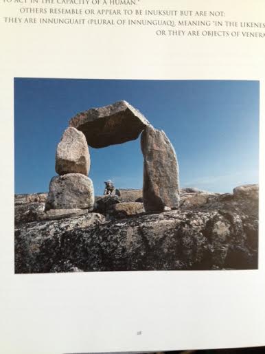
This particular one shows you where to go. You look through the big inuksuk towards the little inuksuk. It points the way. When the little one is in the center of your view, you know that is the direction to go. You are pointed in the right direction.

But think about the people who were there before you. How did they figure out that was a safe way to go? It was very kind of them to leave the stones for you to tell you that this was the best travel route. But think about it. In order to do that, they had to come back safely. They went to the trouble of figuring out a safe passage to start off with and then they came back to put up a marker.

6

It reminds me of a sponsor in AA. They have gone through the difficulty of becoming sober and then they committed to helping you find your way too. It is the same as in Buddhism. Someone who is enlightened, a bodhisattva, renounces going to Nirvana for the sake of everyone else. Instead of leaving this plane of existence, they stay so that they can help others find their way. They show you where it is safe and where it is dangerous, just like these rocks do.

7

(better light)
10

I like this particular inuksuk not only because it indicates direction but also because it looks like a torii gate. They are part of the Shinto religion in Japan. They are not gates to keep people out. Rather, they are an indicator that you have stepped from the secular into the sacred. They let you know that you are on holy ground.

———————————————————————————————————–

This is made with canvas, acrylic paint, a map of Newfoundland, two Canadian stamps, watercolor pencil on water color paper, tissue paper, and matte medium.

Here is a behind-the-scenes illustration of how I created the main Inuksuk.  (which is composed of two Inuksuit)

Here is the reference picture from a book from the library.

rock2

Here is my solution to how to “paint” it.  I drew the stones onto heavy watercolor paper, using watercolor pencils.  Once I was happy with them, I cut them out and glued them together on the canvas.  I essentially created my own stones and stacked them. This meant that I could edit an area without affecting the entire piece.

rock1


Collage, not painting

          I finally figured something out.  I don’t have to paint fine details.  I can do collage.  I can draw what I want separately, using watercolor pencils on watercolor paper.  Then I cut it out and glue it to the painting.  This is such a relief.

          One of my problems is that my ideas far outstretch my abilities.  I’m not very good at painting yet.  I’m trying, but it is going to take a while.  Meanwhile all these ideas keep coming that would work best using painting.

          I have taken only one art class, and that was in high school.  I don’t really know what I’m doing.  I feel like a feral child, wanting to communicate but I don’t have a language.  So I’m making it up as I go.

          One of my fears with painting is there is no “undo” button.  If I make a mistake, it is hard to fix.  It isn’t like working digitally.  Plus, it doesn’t work well with my schedule.  If I only have 20 minutes to work on art, there isn’t really enough time to paint and clean up.

          I have a space painting I was working on.  I’d created the black background earlier.  Just remembering to paint the background first was a big deal.  I thought I was going to paint planets and stars on it.  In the meantime, I started sorting stamps and fortune cookie messages, and came across an old packet of just space stamps.  They are pretty awesome, and I thought I should use them here.  But since they are so rare and I’m so unsure of my abilities, I went ahead and color copied them.

          Yes, I wrote a whole blog post about not doing that.  Yes, I did it.  Whatever makes the art happen counts.  I used funny scrap-booking scissors to cut the edges.  It is more interesting than a plain square cut, and it sort-of gives the impression that it is a stamp.  I looked for scrap-booking scissors that cut like stamp edges, but I didn’t find them.  I had these, and I used them.

          I really liked one stamp of a lady astronaut.   I plan on mixing in other stamps and calling this piece something like “Can’t we all get along / In Space” and having Space be the place where women and men are finally equal and respected.

          The stamp is a bit disembodied though.  I didn’t want just her head floating around.  So I wanted to paint a body for her, but again I felt like I would mess it up.   Then I had a flash.  Draw it separately using watercolor pencils and cut it out.   I put the stamp on the paper for scale and drew around it.  It worked great.

space1

I’ve been using watercolor pencils for a year now, so I’m comfortable with them.  I pulled out an older piece that I don’t really like and tested the fixatives on it.   I used decoupage glue on one section, and matte medium on another.  From that I learned what will work best and how to apply it.  I also used some of the matte medium on a color copied stamp to see if it would affect it.  I know it works great on real stamps, but this is different.  So I put it together and I can’t be more pleased.

          I don’t really know why I didn’t think of this sooner.  Matisse did something like this in his later years.  He cut out construction paper and glued it together.  Eric Carle does this – he paints big pieces of paper and cuts them out.  This isn’t quite the same, but in a way it is.

          I am also working on a painting with inuksuit – the Inuit rock sculptures.   They aren’t just sculptures – they provide direction and tell something about the area.  One will indicate a good place to hunt.  One will indicate a beautiful thing to look at in the distance.  One will mark an initiation area.  Each different shape has meaning, and is often the only way to navigate in a snowy land.

          Here is a picture of one that indicates a direction to travel. It reminds me of a Japanese torii gate.


rock2

I was going to draw the whole thing with this new technique and then I had another idea. Draw the stones separately, and assemble them.

rock1

Sure, I’ll work on getting better at painting using brushes. That is the only way to get in any detail. But in the meantime, I’m glad I’ve discovered this.