I decided that I wanted to try to make art like Nick Bantock does. I still don’t have image transfer down, so I’m using several of his other techniques in the meantime. You can learn a lot about collage and layering art from many other sources, but Mr. Bantock has two different books that will give you an insider’s look into his personal process. They are “Urgent 2nd Class: Creating Curious Collage, Dubious Documents, and Other Art from Ephemera” and “The Trickster’s Hat: A Mischievous Apprenticeship in Creativity”.
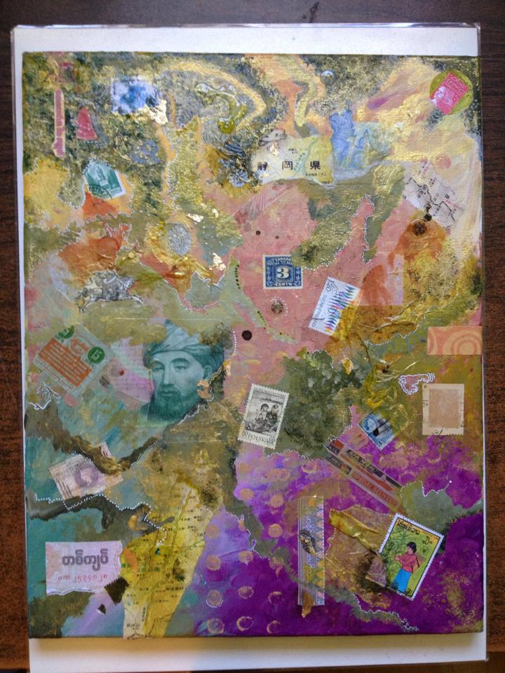
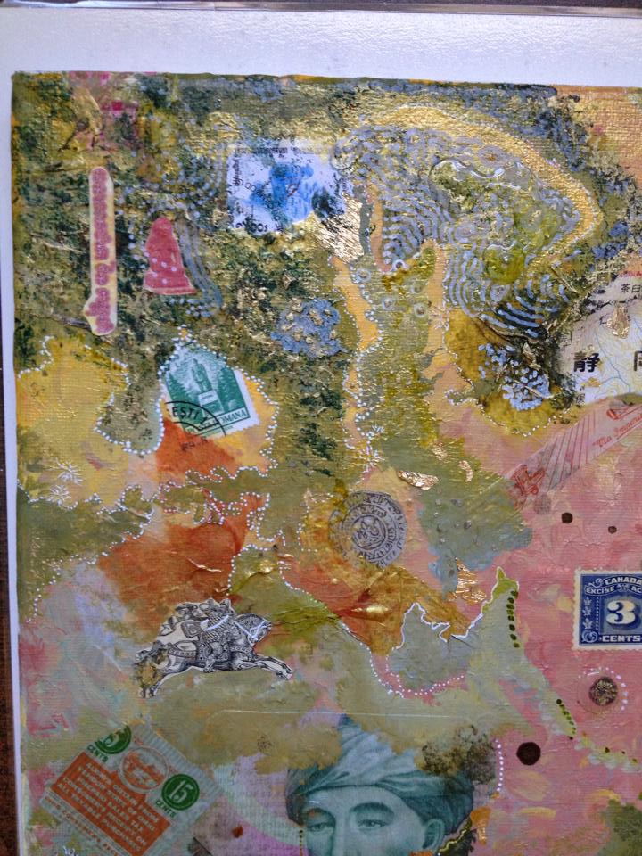
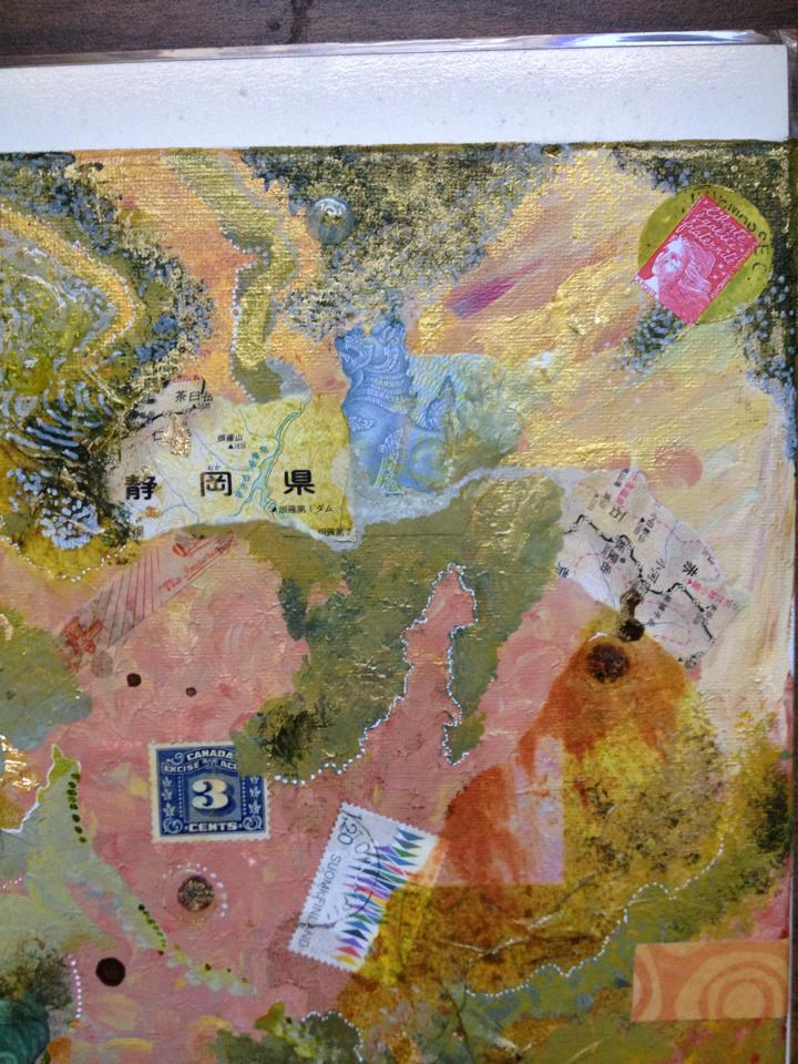
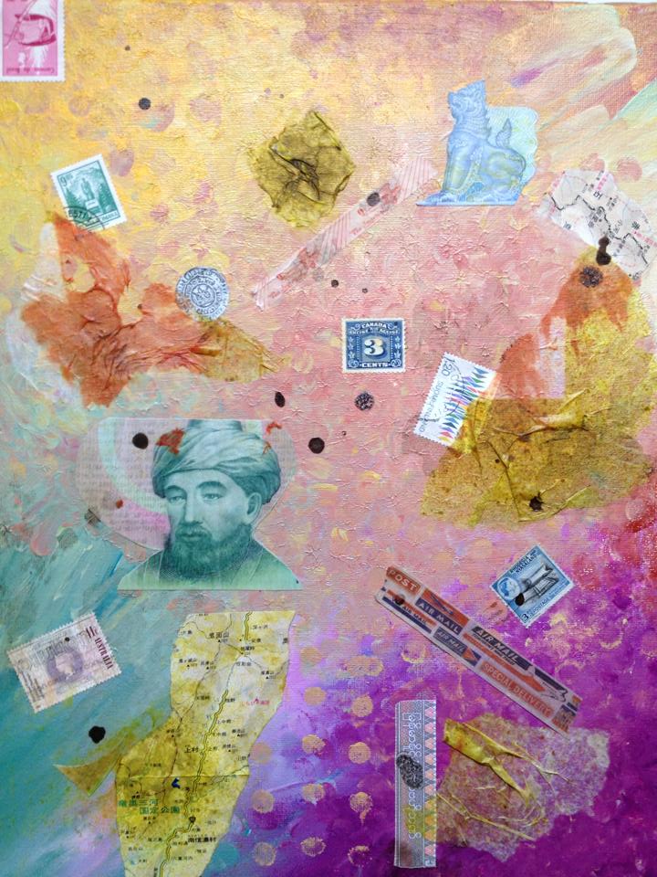
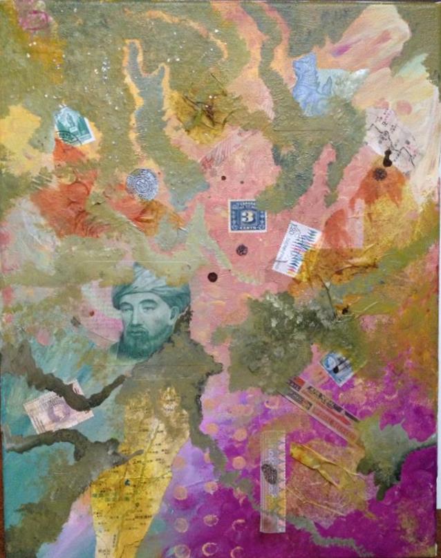
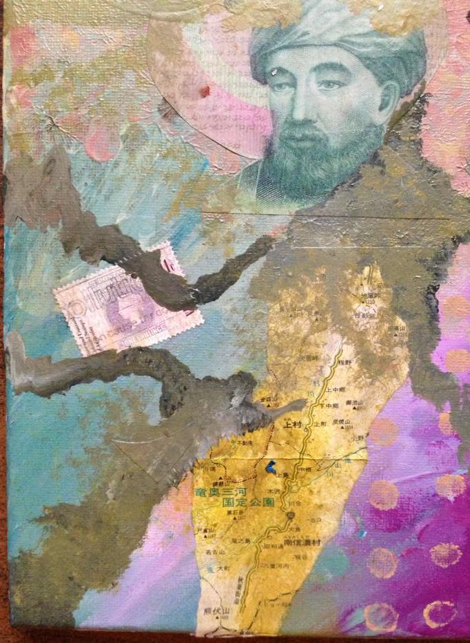
Here is the first bit, which actually has two layers – paint and ephemera such as foreign money, stamps, and maps.

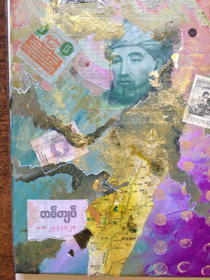
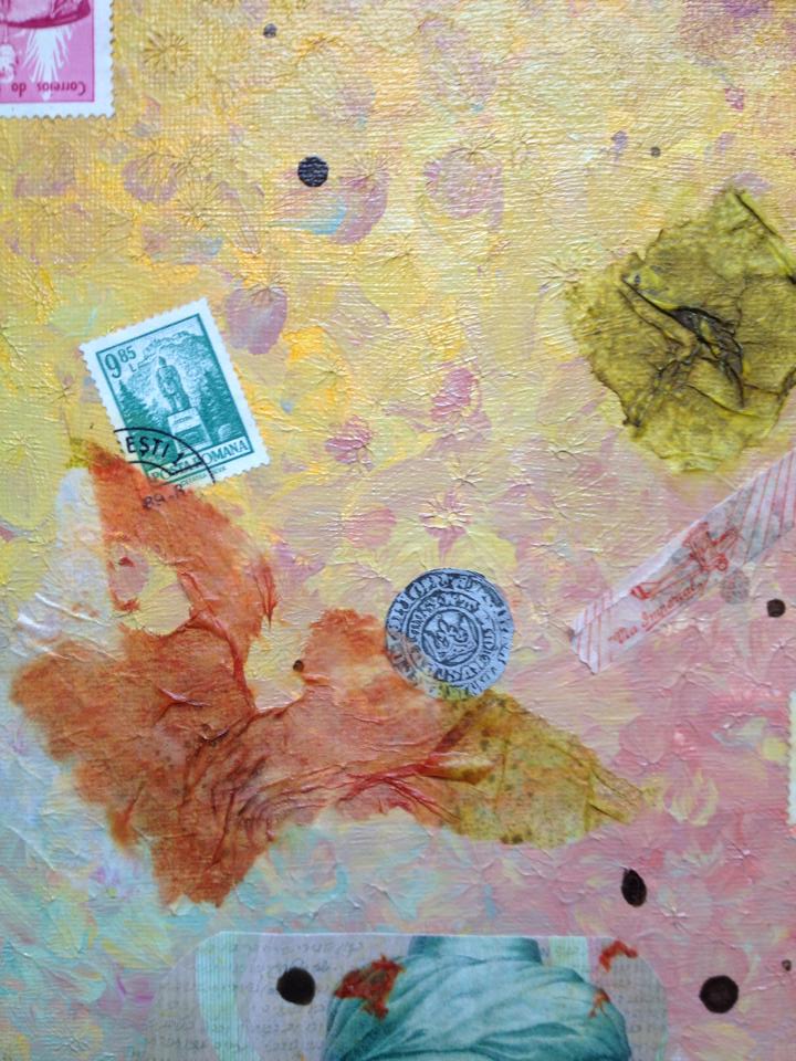
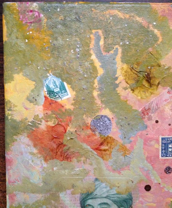
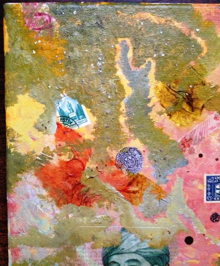
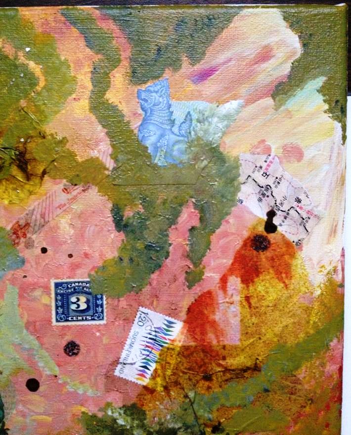
Closeup of top left

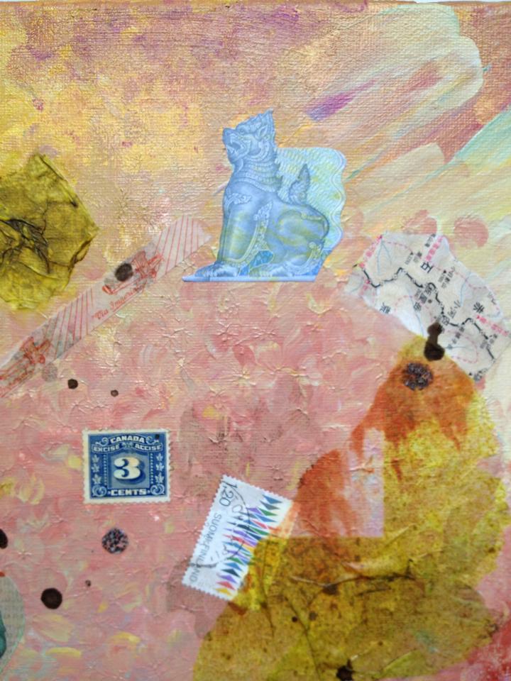
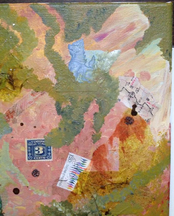
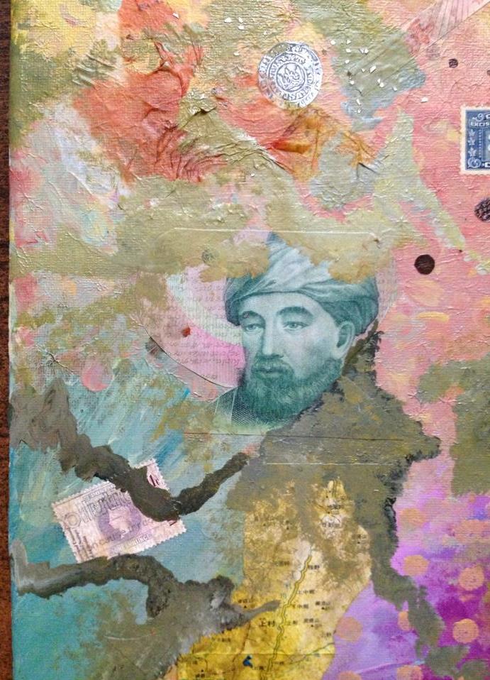
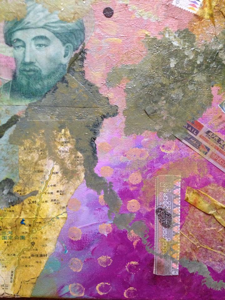
Top right

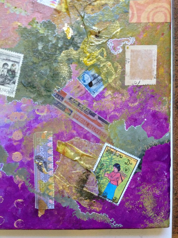
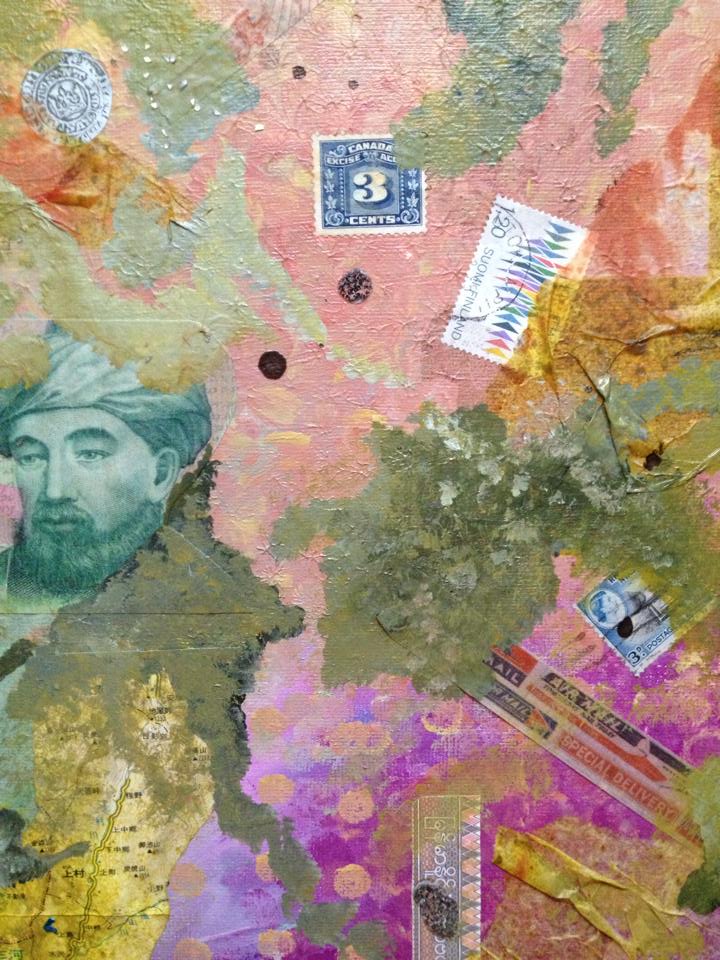
Bottom right

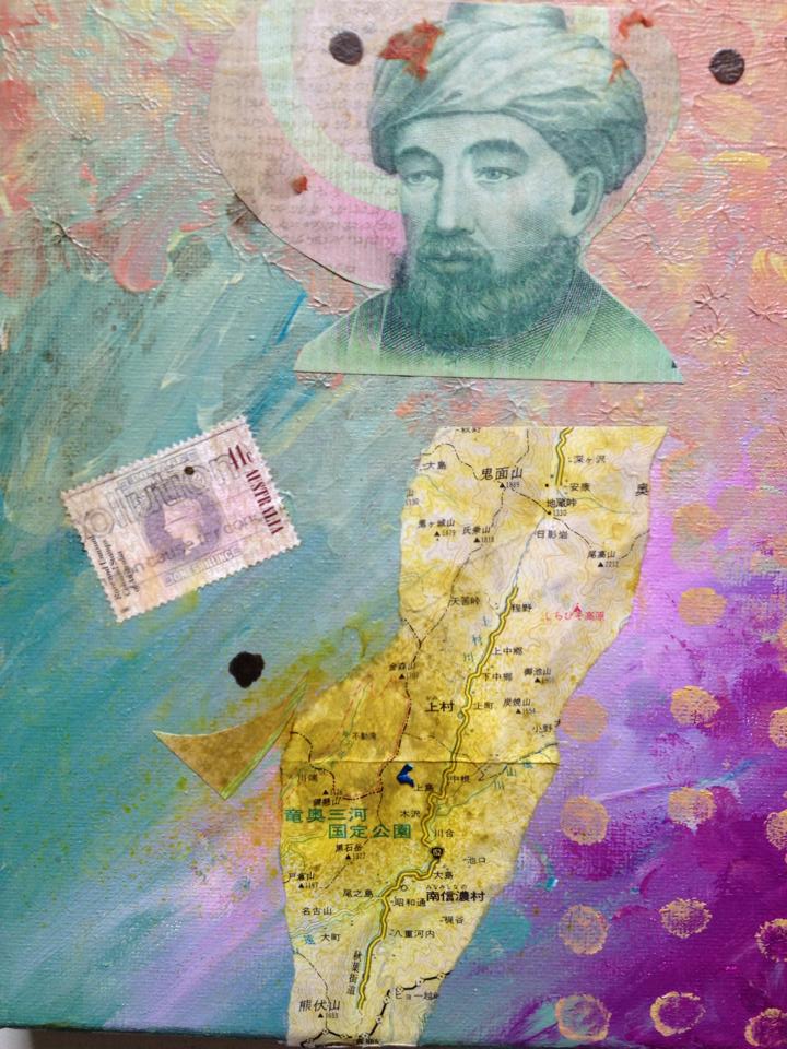
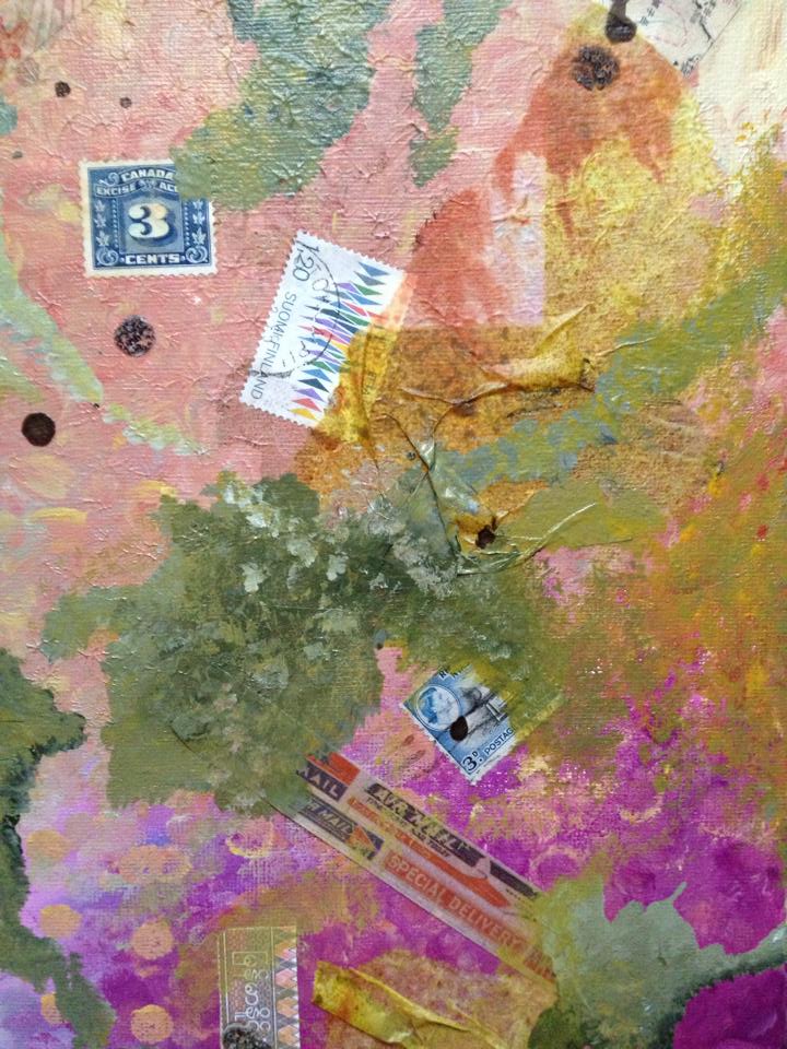
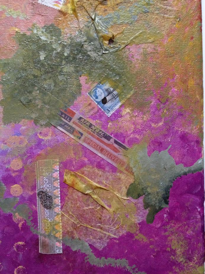
Bottom left

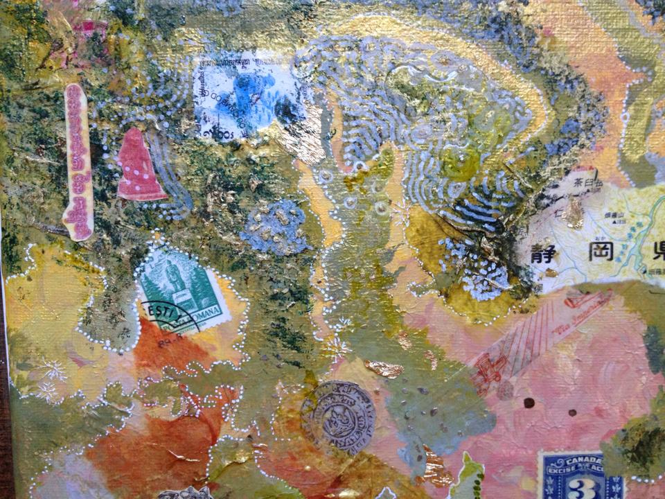
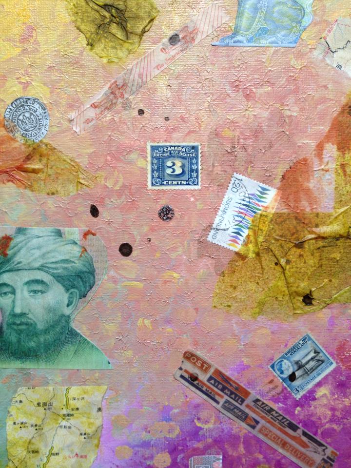
Middle

It took two days to get to this point. Then it took a few more days of looking at it to start painting over the areas that still needed work. I wanted to darken it at first, but then I decided to work with the colors I had. I mixed together copper and olive paint with some watered down white and got a mix kind of like camouflage and worn American dollars. I started to apply it and then added more of yellow and black to adjust it. It wasn’t the colors I’d used at all, but it was a nice alternative than just painting black.
This is what I got.

When doing the cropping of the photo I decided to enhance the colors a bit digitally to see if I can show what they really look like in person. This is a little much, so you’ll have to kind of imagine that it is a little less than this, and a little more than the previous.

The idea of continuing to work on it is to make it all good. There are always areas that are better than others when you work on a collage or painting. Keep those, and add to the areas that aren’t so good. Keep editing until it is perfect.
I’m not enjoying this process as much as I’ve been enjoying the art journaling. That is faster, certainly, but it also seems to produce strong emotions and memories while I work. That in itself is the reason to do it. This is not producing many feelings, other than a desire to stop working on it to preserve it as is.
I’m learning that I feel very attached to the layers as I make them. I’ve not wanted to paint over any of it, even the so-so parts, because I don’t want to lose anything. This is the mindset that makes some people keep old things stored away in their basement with the idea that “one day” they will need it. I’m trying to work with and around that, so that is why I decided to take pictures as I work on this.
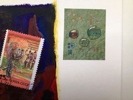
Here are the detail photos from the second set. There are two to four layers in each photo.
Top left

Top left (enhanced)

Top right

Top right (enhanced)

Center left

Center middle

Center right

Bottom left

Bottom center

Bottom right

I’ll add further pictures in a separate post as this progresses.
—-Materials used (so far)—–
Stretched canvas
gesso
Acrylic paint
tissue paper (some with Distress Ink on the underside)
matte medium
stamps
Asian map
photocopies of foreign money
“crushed glass” glitter
tools – fingers, paintbrush, sponge brush, tissue paper


You must be logged in to post a comment.