Fitzcarraldo
n. an image that somehow becomes lodged deep in your brain—maybe washed there by a dream, or smuggled inside a book, or planted during a casual conversation—which then grows into a wild and impractical vision that keeps scrambling back and forth in your head like a dog stuck in a car that’s about to arrive home, just itching for a chance to leap headlong into reality.
Category Archives: Collage
Into the deep (further work, as of 4-7-16)
I’m still not sure if this is done. Perhaps another year will pass before I see what needs to be done. The dark blue is too intense, but I also don’t want to essentially copy the color scheme I used with a recent piece. I’ve added so much detail to the blue that I kind of don’t want to cover it up, but perhaps the detail wasn’t enough to fix the problem. Or maybe “art is in the eye of the beholder” and someone else will like it.
11 x 14 canvas
Acrylic paint
Stamps
Gel pens
Tissue dyed with distress ink
Broken key
Glitter gem
Chalk pen
Decoupage glue
Glazing medium
Pages from a Jacque Cousteau book.
Avenoir
Avenoir –
n. the desire that memory could flow backward. We take it for granted that life moves forward. But you move as a rower moves, facing backwards: you can see where you’ve been, but not where you’re going. And your boat is steered by a younger version of you. It’s hard not to wonder what life would be like facing the other way…
Tim Holtz art paper page
torn out color images from a AAA magazine
Strathmore art journal
November rain (further work)
14 x 11 canvas
Acrylic paint
Stamps
Gel pens
Decoupage glue
Broken key
Crushed glass glitter
White gel pen
Chalk pen
Match used to light Sabbath candle
Copied money from Israel
Ephemera.
Leaf skeleton
Tissue colored with distress stains
Matte and glazing medium
Current iteration worked on March and April 2016. (It may or may not be completed. I’m not really happy with it right now. I like parts of it.)
Blue escape
A meditation on leaving bad doctors, clubs, churches – of feeling ignored, part of a machine, a number but not a name. How big community isn’t community anymore. And – an excuse to make use of an art supply that others don’t think of as an art supply – aluminum foil. Thus – Seeing things in new ways. Making use of a bad situation.
Gesso
Crumpled thin aluminum foil from Baja Burrito
Tissue with distress ink stains
Stamps
Envelope
Copied money
Acrylic paint
Crushed glass sparkle glitter
Glazing medium
14 x 11 canvas
Current iteration worked on March and April 2016. (It may or may not be completed.)
Into the deep (part 4)
This layer was added this morning (3-29-16).
Additions –
bronze and gold gel pen
white chalk pen
decoupage glue
“abandoned coral” Distress stain
the broken tip of a key (found)
glitter gem
top right
bottom left (pleased to discover that the edge of the book page didn’t glue down well. I’ll add a red stamp here later)
bottom right (The glue will go shiny and translucent when dried. The key tip reminds me of Noah’s ark.)
Middle detail
I’m reminded of the photographic idea of dodge and burn. I’m highlighting certain areas and downplaying others. I try to make it look like it is all planned, but I’m making it up as I go along. It is a voyage of discovery.
This is kind of like when I painted the bathroom by myself. It took four hours. I was alone with my own thoughts all that time, and it was a little intense. This is also part of why I partly dislike how I exercise – water aerobics. I can’t listen to an audiobook while I do it, and I can’t take down notes of ideas I have. I’m stuck with myself, and that is hard sometimes. But I do it because it is always important. If you can’t stand being by yourself, then who would want to spend time with you? Friendships need to be constructed of two equal people who can stand on their own, and work even stronger together. If one or both lean on the other too much, it is harmful.
November rain
This is a work in progress. This is the second layer. This is the companion to “Deep art” (which the title itself is a work in progress). I was working on this one first and had spare paint to use up.
Here is the original full canvas.

I fingerpainted the original colors onto the canvas about a year ago. I don’t remember what colors I used. This was before I started documenting the layers of my creations. I also thought that I was done with this because I liked it like it was. However, after reading several Nick Bantock books, I’ve decided to push it a little more. Plus – canvases aren’t cheap and they take up space. So it is either add more to them or start finding a market for what I’ve done. Speaking of that – if you like what I’ve made, let me know. We can work out a price that is good for both of us.
Here is the second layer full canvas.
I’ve added some washi tape and stamps. I’ve learned the hard way that if I’m too liberal with the matte medium, it covers over areas of the paint outside of what I’m trying to glue down, leaving a dull smear. Also added are layers of tissue paper that I colored using Distress Ink stains. I let them dry first, and affixed them to the painting colored side down.
The paint colors that are in the second layer are titanium white, cadmium yellow deep hue, and Payne’s grey. I put blobs of them into a large yogurt lid and put some glazing medium on top. I blended them only as I went, using the brush.
Into the deep (part 2)

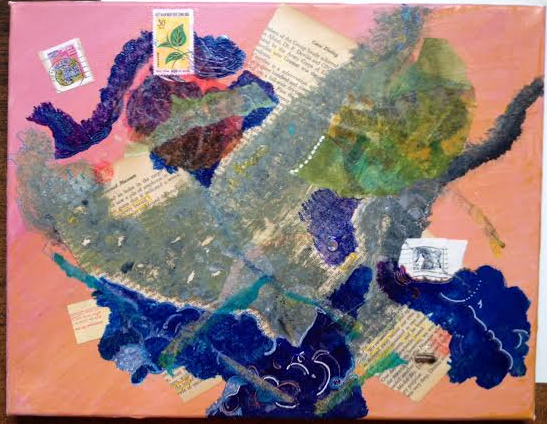
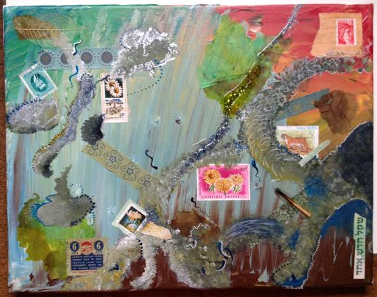
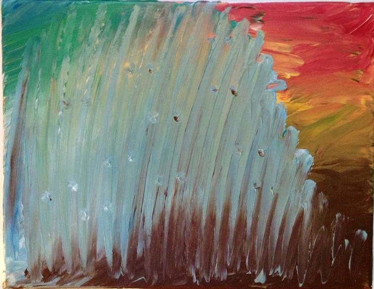
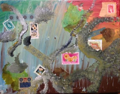
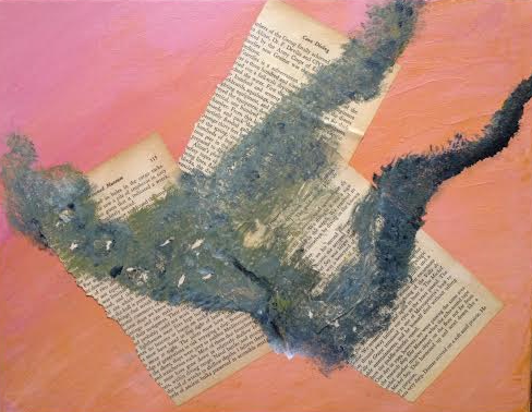
This is the full piece, but just the second layer. More to come. I’m documenting the creation of it.
The base of this was a generic painting background I did maybe a year ago. Yesterday, I was working on another piece and had some spare paint. I fished around the not-yet-completed stack of canvases and found this one. I decided to add some pages to it first because I like the look of words showing through paint. It is hard for me to remember what order things should be done, but I’m getting better. Rather than just gluing or painting on the canvas by feel, I’m trying to think about how I want the finished piece to look.
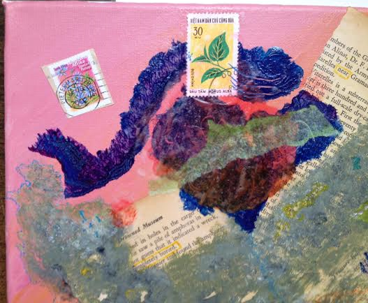
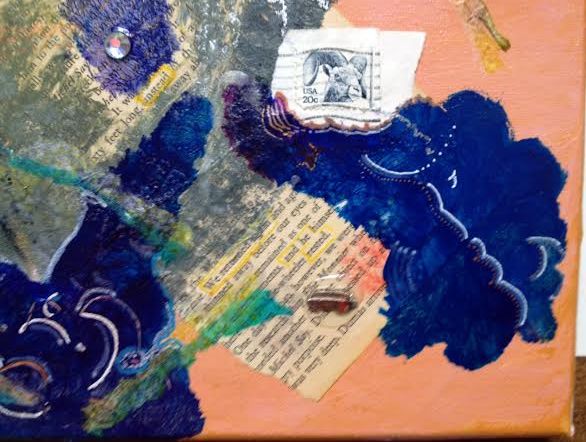
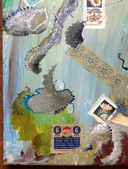
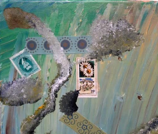
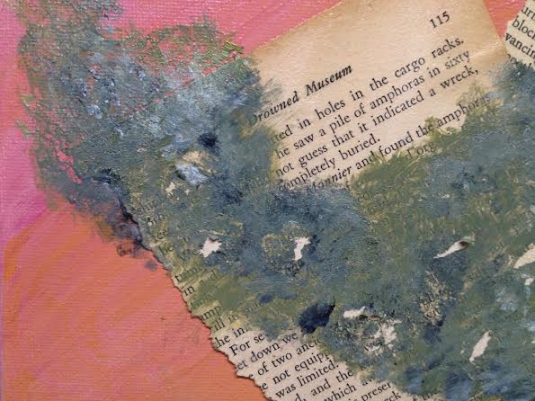
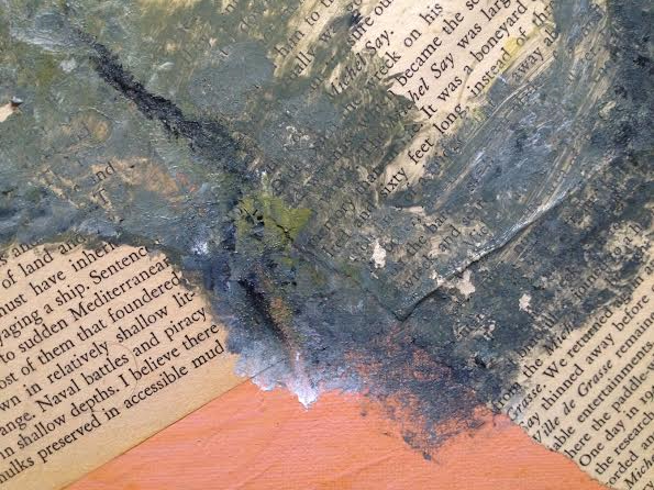
Sometimes making art is about just going with the feeling, and sometimes it is about trying to say something. Sometimes it is a little of both.
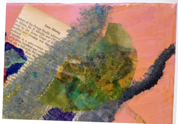
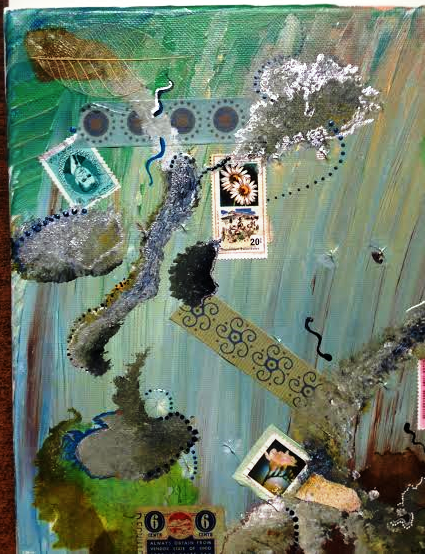
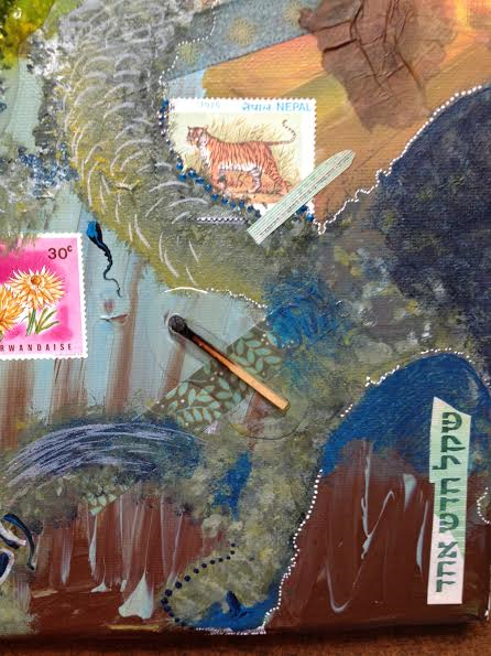
I dug around my “to be torn up” pile of books and chose “The Silent World” by Captain J. Y. Cousteau.
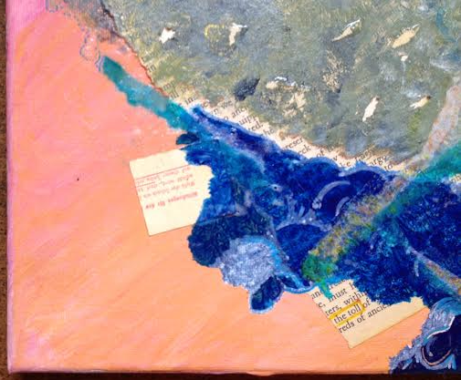
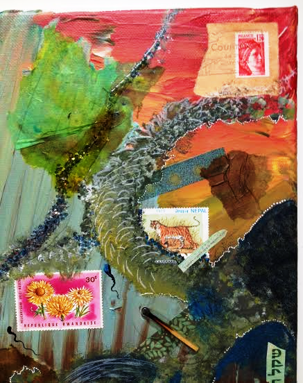
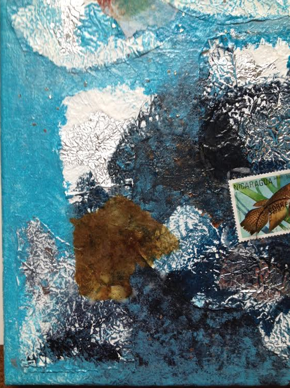
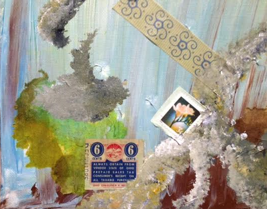
(bottom right detail)
Tearing up books to use in art was a hard thing to get over, being a life-long reader and a library worker. I have about five books to do this with, and I got them all for free. I guess ideally I’d use different books for each piece, but I can’t justify trashing a book for just three or four pages.
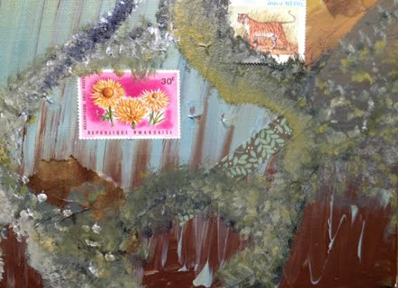
(middle detail)
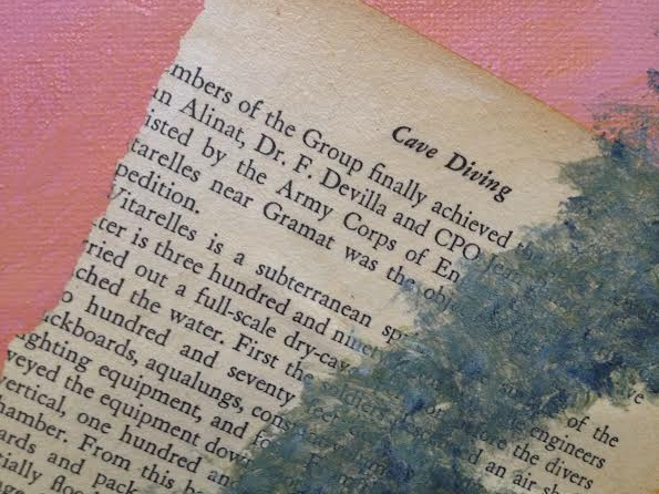
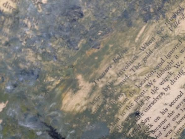
I pulled out random pages, and here are the chapter titles for the three different pages. I liked them enough to make sure that I don’t totally obscure them.
Drowned museum
Cave diving
Treasure below.
I don’t remember what the base coat colors are. The paint colors that are over the pages are – titanium white, cadmium yellow deep hue, Payne’s grey. I put blobs of them into a large yogurt lid and put some glazing medium on top. I blended them only as I went, using the brush. I was surprised to discover the mix ended up being a mossy green. It looks worn, like rocks with lichens. But it also looks a bit like bird poop. While trying to remove some of the paint from the pages so I could see the words, the paper tore. I liked the look, so I kept doing it.
I’m meditating while working on this about young people who are lost, who haven’t been raised with any moral foundations. They don’t know right from wrong because they weren’t ever taught. After a certain point, a person is too old to be taught this in any meaningful way. On the surface, they look normal, but deep underneath there is darkness. These people are the scariest of all, because they don’t even know when they have crossed a line.
This is a way to meditate and pray yet make something at the same time.
Kenopsia
n. the eerie, forlorn atmosphere of a place that’s usually bustling with people but is now abandoned and quiet—a school hallway in the evening, an unlit office on a weekend, vacant fairgrounds—an emotional afterimage that makes it seem not just empty but hyper-empty, with a total population in the negative, who are so conspicuously absent they glow like neon signs.
created 3-25-16
Strathmore art journal
glue stick
scissors
art paper
ad from AAA travel magazine
chopsticks wrapper from a Japanese restaurant I ate at alone on my day off, even though my husband had been gone on a trip for a week and had just come back.
Enouement
n. the bittersweetness of having arrived here in the future, where you can finally get the answers to how things turn out in the real world—who your baby sister would become, what your friends would end up doing, where your choices would lead you, exactly when you’d lose the people you took for granted—which is priceless intel that you instinctively want to share with anybody who hadn’t already made the journey, as if there was some part of you who had volunteered to stay behind, who was still stationed at a forgotten outpost somewhere in the past, still eagerly awaiting news from the front.
created 3-17-16
Strathmore art journal
glue stick
scissors
art paper
map pieces
origami paper


You must be logged in to post a comment.